Importance of a beautiful shop in WooCommerce
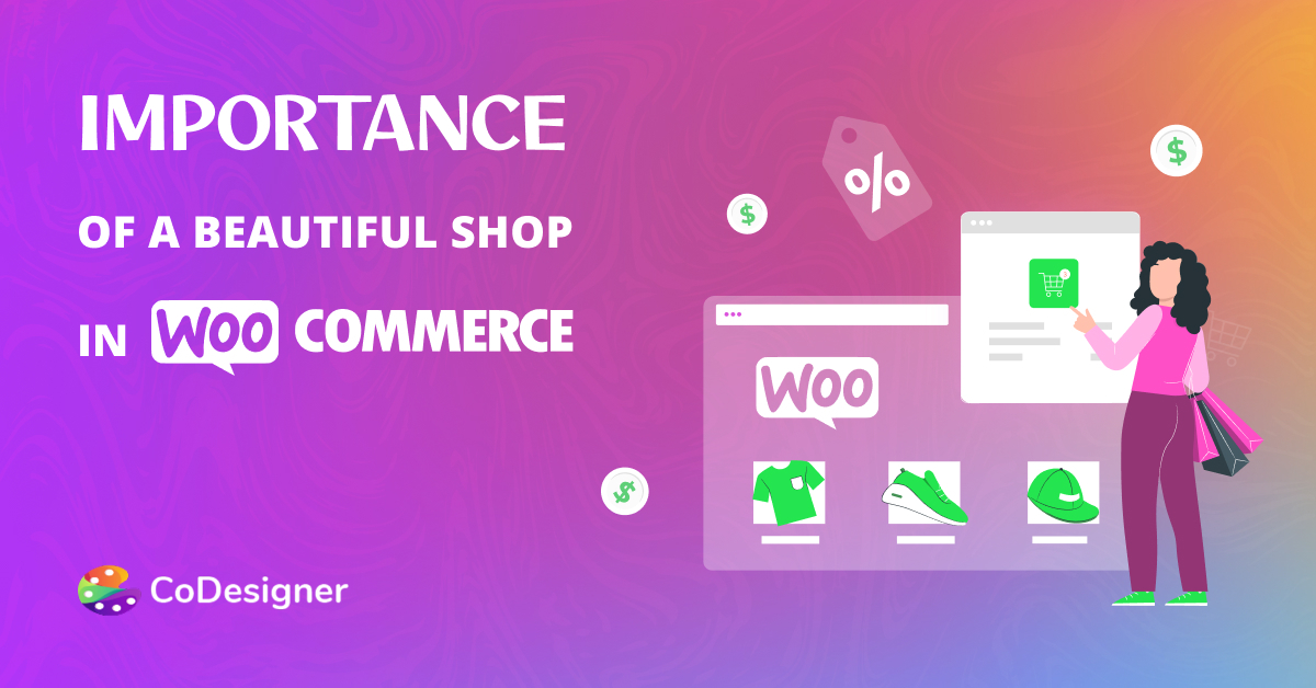
These days we do almost everything online including shopping. That’s why there’s never been a better time to start your own eCommerce Shop. If you are selling anything- it can be either sneakers, ready-made food, groceries, electronics, clothes, or something in between- then you need to level and onboard to the eCommerce world.
An E-commerce site offers you the best chance to build your brand, connect with more relevant customers, and sell more products. But all this will happen if you have got the right design for your website!
Web design is often critical when creating an eCommerce website. Good web design is all about using the right colors, fonts, images, words, and amazing graphics to convince visitors to make a purchase. It’s like decorating a beautiful shop in real life. The eCommerce website design should attract potential customers, provide a great user-friendly experience, and present your shop in the best way possible.
So, not only does your site have to feel like a brand but also needs to drive your website to more sales. But now the question comes- how exactly? How to design such an effective design that will have the products flying off your virtual shelves!!!
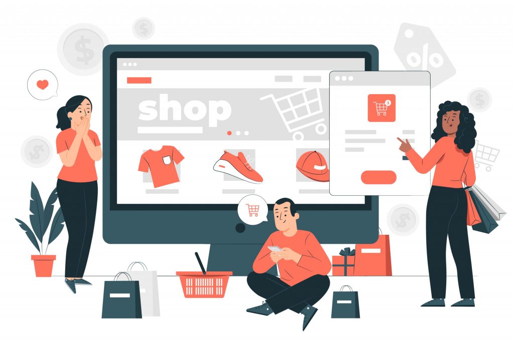
Choose WooCommerce for your business
Compared to other eCommerce platforms woocommerce is the most widely used eCommerce platform in the world. More than 26% of the leading e-commerce website uses woocommerce for their online store. Because its responsive design, SEO-friendly interface, and advanced features make the purchase process easy and stress-free for customers.
Woocommerce flexibility allows the seller to customize and modify everything from product placement to customizing the whole storefront. It is a cost-effective platform compatible with the world-leading CMS platform WordPress. There are lots of advanced built-in features like a pre-installed payment gateway, geolocation support, advanced inventory management, easy tax calculation, and many more that make it the best eCommerce platform in the market.
Here are some great ideas to take your shop to the next level:
Keep it simple
One of the most important rules you should keep in mind during the WooCommerce design process is to keep it simple. When it comes to designing a WooCommerce website, simple is always the right choice. Because, the more elements such as banner ads, and pop-ups you have on your website, the more it takes away from the entire goal of the website.
You don’t need a ton of ads and banners on your WooCommerce website. Because all they do is act as a distraction. That’s why it’s really important to keep the design clean, clear, and simple.
Try to think like a website visitor
If you want to make your website design connect to your audience, you better think like an audience. Customers always want a few things in a website- easy to navigate, well-designed, and an easy shopping process.
During the design process, you should keep these things in your mind. When you can think like a customer it will be easy for you to anticipate what they really want from your store.
Use high-quality shop designs
If you want to add high-quality shop designs to your website you can take the help of some great plugins out there. These plugins will help you get the job done easily without any coding knowledge. CoDesigner can help you out with this one and many more design factors that we will discuss shortly.
CoDesigner has some great pre-build shop designs to help you save both your time and effort on the design. You can choose from great designs like Shop Curvy, Slider, Accordion, Flip, and many more.
Make your content scannable
No one actually goes through a long product description and you need to think many times before creating one. It’s wise to highlight the key features that will attract the customers and it’s basically what they are looking for.
Research shows that most website visitors usually read only the highlighted text on any webpage, instead of reading word by word. You also do the same thing, just scan through the content for the text you are looking for. So, if you want to drive more sales to your site make the contents scannable. You can try adding a short description widget from CoDesigner instead.
Make easy-to-navigate categories
Customers often get lost when there isn’t proper categorization of products on a WooCommerce website. So, you need to make it super easy for them to get products according to relevant categories. Adding a product category tab can be a good one.
Without these category tabs, your customers will get annoyed and bounce on every product page until they find what they need. Your category tabs give customers a high-level location of where they want to be, and your filters can help them narrow their options. CoDesigner also has a solution for this. It has 4 different tab styles that will make both you and your customers happy by saving time.
The easier you make your categories and pages to navigate, the easier it will be for the customers to find their desired products in seconds. Thus, it will be easier for you to grow your business.
Make checkout an easy process
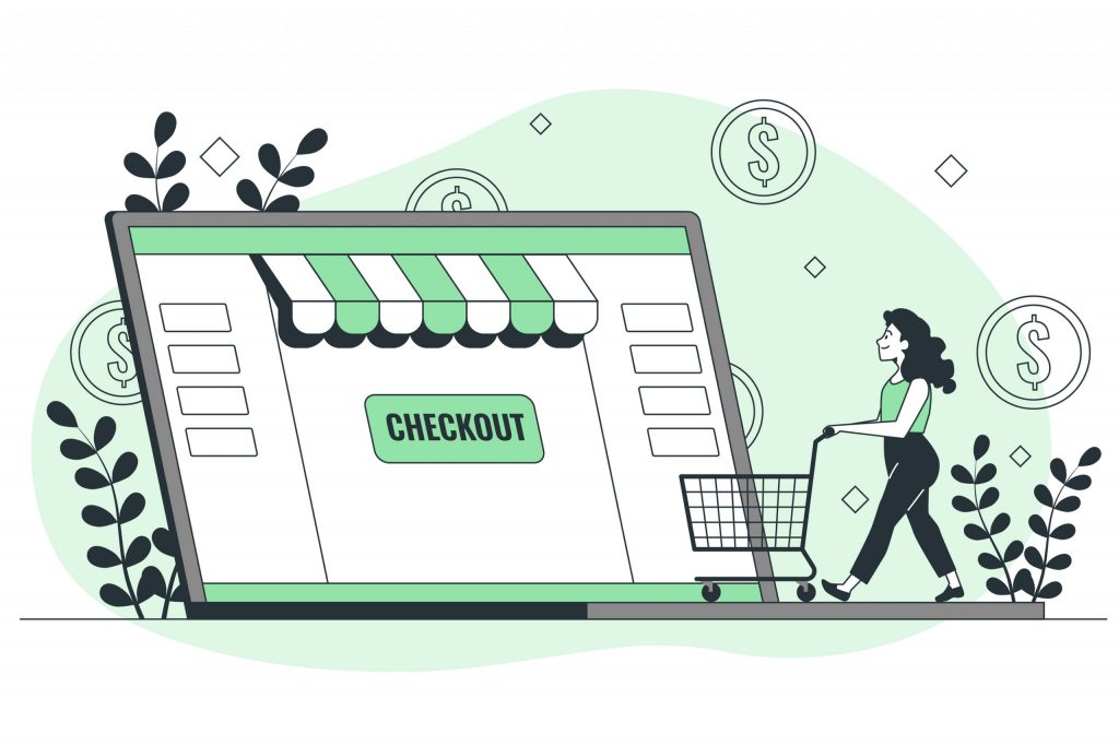
A complex creates chaos if it contains too many fields and redirections to complete a simple purchase. After doing all this hard work, a complex checkout process can kill all this effort in seconds. So, it’s better you make the buying process as simple, straightforward, and as pain-free as possible.
Try to make your checkout page clean, simple, and easy to navigate. Make the option for your customers to register to your site or check out as a guest. Add particular tables like billing address, shipping address, order notes, checkout login, and payment methods. If you are confused about how to make things straight, then try CoDesigner checkout widgets and create a checkout page by simply dragging and dropping.
Make your design responsive
It’s an era of mobile devices and a popular way to surf the internet and that includes shopping. So, if you want to capture the customers who buy things mostly through mobile and tablets, you need to make sure that your WooCommerce website is fully responsive. Otherwise, you won’t be able to convince those mobile visitors.
Wrapping things up
Designing a WooCommerce website can be tricky. But if you play wisely and know all these key points then you will be able to make your website design a complete masterpiece. So, what are you waiting for? Use these tips and CoDesigner to make your online shop stand out in the crowd.
Subscribe to Our Newsletter
Get the latest WordPress tutorials, trends, and resources right in your inbox. No Spamming, Unsubscribe Anytime.

Thank you for subscribing to our newsletter!


