WooCommerce Design Trends That Actually Convert in 2026



Most WooCommerce store owners think about design the wrong way. They ask: “Does my store look good?” The right question is: “Does my store convert?”
These are not the same question. In 2026, with global ecommerce competition at an all-time high and shoppers more discerning than ever, design choices have a direct, measurable impact on revenue. A clean layout means nothing if the checkout hemorrhages customers. A stunning product page fails if it takes 3 seconds to load on mobile.
This guide covers the WooCommerce design best practices and ecommerce design trends 2026 that are actually moving the needle – grounded in conversion data, not aesthetic opinion.
Why “Good Design” Is No Longer Enough
For years, the goal of WooCommerce design was simply to look credible. A decent logo, a clean layout, and readable product descriptions were enough to stand out. That era is over.
Design is now a performance tool. Every layout decision, color choice, and interaction pattern either moves a visitor closer to checkout or pushes them away. The data makes this impossible to ignore:
- Sites loading under 2 seconds convert approximately 2× better than slow stores. (Portent)
- Displaying reviews can increase conversion rates by up to 270%. (Spigel)
- Simplifying a checkout form from 18 to 8 fields pushed one store’s conversion rate from 25% to 42% in two weeks. (StackWC)
- Nearly 70% of carts are abandoned before purchase – and design is a primary driver. (Upsella)
The trends below exist to close that gap between traffic and revenue and help you achieve a high-converting WooCommerce design.
7 WooCommerce Design Trends Dominating 2026
There’s no magic design formula to increase WooCommerce conversions. Most stores just get the basics wrong. Get them right, and results follow.
Here are 7 design moves that actually work – when done right.
1. Mobile-First Design – Done Properly This Time
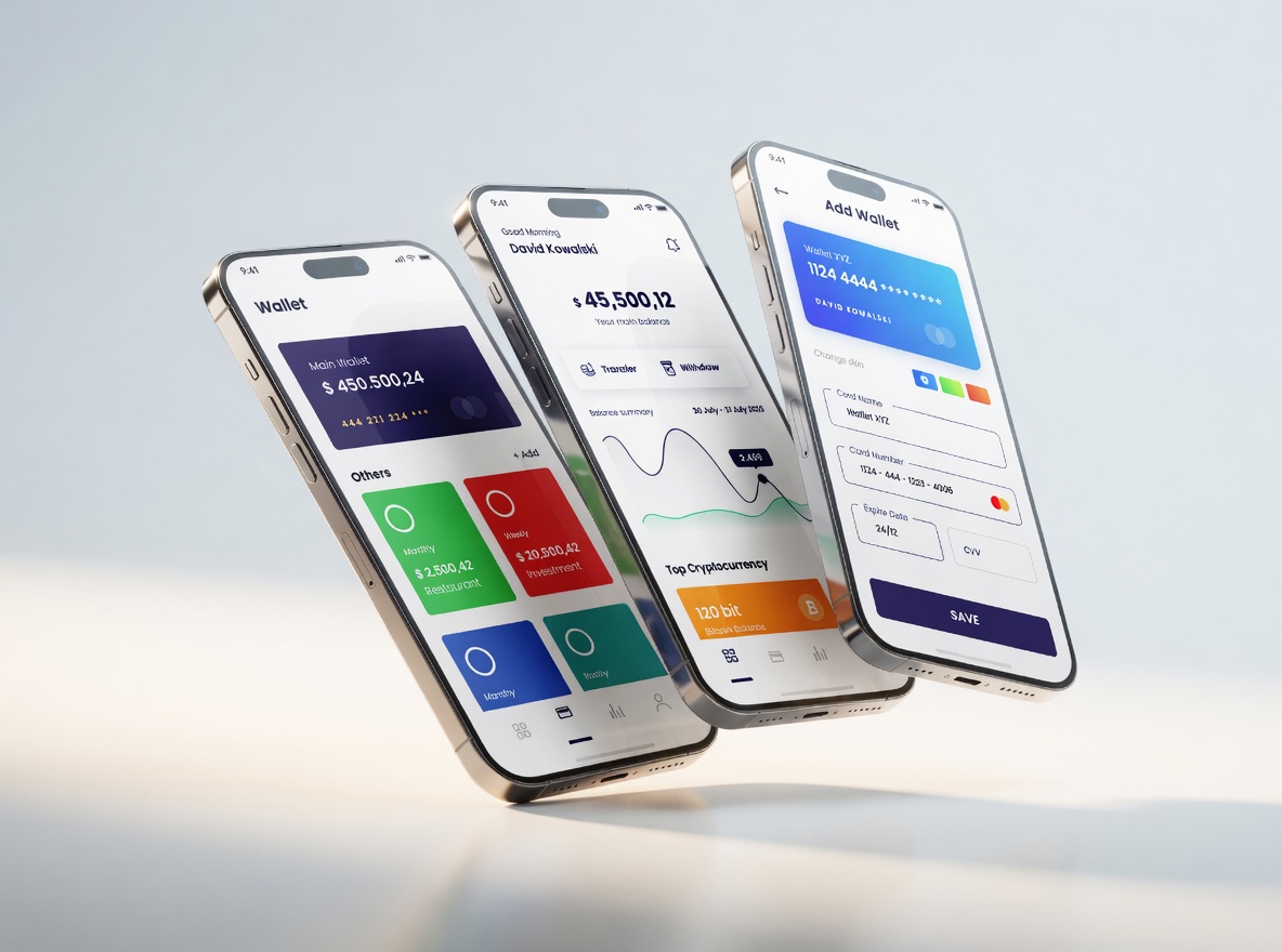
Mobile-first has been discussed for years. But in 2026, over 75% of global ecommerce traffic originates from mobile, and 50%+ of ecommerce revenue is generated on mobile devices. Yet cart abandonment on mobile sits at 80.2% – versus roughly 70% on desktop. (Source: Salesso, Redstagfulfillment, & ContentSquare)
That gap tells a clear story: stores are receiving mobile traffic but failing to convert it. The cause is almost always design. Implementing a proper mobile-optimized WooCommerce design is critical.
What a true mobile-first WooCommerce UX design looks like:
- Thumb-zone navigation. The bottom third of a phone screen is easiest to reach one-handed. High-converting stores position key actions – Add to Cart, search, navigation – in this zone. Anything requiring a stretch creates friction.
- Sticky “Add to Cart” and “Place Order” buttons. These should be pinned to the viewport at all times. A customer should never have to scroll to find the buy button.
- Collapsible order summaries at checkout. Showing a full order breakdown before the payment form pushes the critical action off-screen on small devices. A collapsed summary that expands on tap keeps the conversion step front and center.
- Large input fields and no pinch-to-zoom. Checkout forms should be thumb-friendly – tappable, spacious, and readable without zooming. Every pinch-and-zoom moment at checkout increases the risk of abandonment.
The underlying principle: design for the thumb, not the cursor.
2. Speed Is a Design Decision – Core Web Vitals 3.0
In 2026, Google’s Core Web Vitals WooCommerce requirements will have tightened. The target Largest Contentful Paint (LCP) for competitive stores is now under 1.2 seconds.
A 1-second delay in page response can cause a 7% drop in conversions, and nearly 57% of shoppers abandon their cart when load times exceed 3 seconds.
Speed is not a developer-only concern. It starts with design choices and fast-loading WooCommerce design principles:
- Image strategy. Hero images and product photos are the most common culprits for slow LCP. Serving images in WebP or AVIF format, sized appropriately per device, is non-negotiable. Every oversized image is a liability for conversions.
- Font discipline. Decorative custom fonts carry a loading cost. In 2026, high-converting stores use system font stacks or preload brand fonts to eliminate layout shifts and rendering delays. Each custom font should earn its place by contributing meaningfully to the brand or reading experience.
- Plugin audits. Many WooCommerce stores run 40–60 active plugins. Each adds JavaScript and CSS overhead. A regular design audit should include removing visual widgets and animation libraries that add load time without adding conversion value.
Fast stores do not happen by accident. They are the result of deliberate design restraint at every step.
3. Product Page Design – The Make-or-Break Moment
The product page is where purchase decisions are made. No other page has a greater direct impact on conversion rate. In 2026, the highest-converting product page design WooCommerce implementations share a specific anatomy.
Everything That Matters, Above the Fold
A visitor should be able to make an initial purchase decision without scrolling. That means:
- Product title – clear, benefit-forward
- Price – prominent, with sale pricing and savings visually distinct
- Primary image – high-resolution, zoomable, showing the product in context
- Add to Cart button – visually dominant, high contrast
- Key trust signals – Product reviews, shipping estimate, return policy summary, testimonials
Imagery That Builds Visual Confidence
Product images carry enormous conversion weight. In 2026, shoppers expect multiple angles, lifestyle photography showing the product in real-world use, and – for products where texture, fit, or movement matters – video or 360-degree views. Product videos are no longer a premium feature; they are a baseline expectation.
Visual Swatches Over Dropdowns
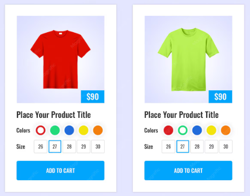
Color and variant selection is a persistent friction point. Best practice: show color options as actual swatches, not text in a dropdown. Update the product image dynamically when a variant is selected. Update the price instantly when selections change. Customers should never have to imagine what they’re ordering.
Social Proof Woven Throughout
Reviews do not belong at the bottom of the page inside a tab. 98% of consumers read reviews before purchasing. The star rating and review count should appear directly beneath the product title. Pull compelling one-sentence quotes into styled callout blocks near the Add to Cart button. Display customer photos in a UGC gallery alongside professional imagery.
The rule: social proof should be integrated into the page, not appended to it.
4. Checkout Design – Where 70% of Revenue Is Being Lost
Cart abandonment is the most expensive problem in WooCommerce. The average abandonment rate is approximately 70%. Design is the primary lever for reducing it, and checkout optimization WooCommerce requires a strategic approach.
Minimize the Form
Research shows that forms with a maximum of 15 fields produce a 109% boost in conversions compared to longer forms.
Audit your checkout: Are you asking for a phone number you don’t use? A company name on a B2C store? Every unnecessary field is a reason to leave.
Enable guest checkout as the primary path. Account creation should be offered after the order is complete, never as a gate before it.
Validate Inline, Not on Submit
Showing error messages only when the customer clicks “Place Order” forces them to hunt through a completed form for mistakes. Real-time, field-level validation – a green checkmark when a field is filled correctly, a specific error message when it isn’t – significantly reduces checkout frustration and abandonment.
Express Payments First
In 2026, offering only card payments is leaving revenue on the table. Apple Pay and Google Pay should appear above the form as the primary checkout option for mobile users. Buy Now, Pay Later (BNPL) options – Klarna, Afterpay, Affirm – have become standard expectations, particularly for higher-ticket items.
The sequence matters: express options before the form, not after it.
Trust Signals at the Point of Payment
Buyer anxiety peaks when a customer is about to share payment information. The design should address this directly:
- An SSL padlock icon with brief security copy (“Secure checkout, 256-bit encryption”)
- Payment method logos (Visa, Mastercard, PayPal) – familiarity reduces perceived risk
- A clear, linked returns policy
- A brief customer support note
None of these elements requires significant space. Their absence, however, is felt.
5. Typography and Color – The Invisible Conversion Lever
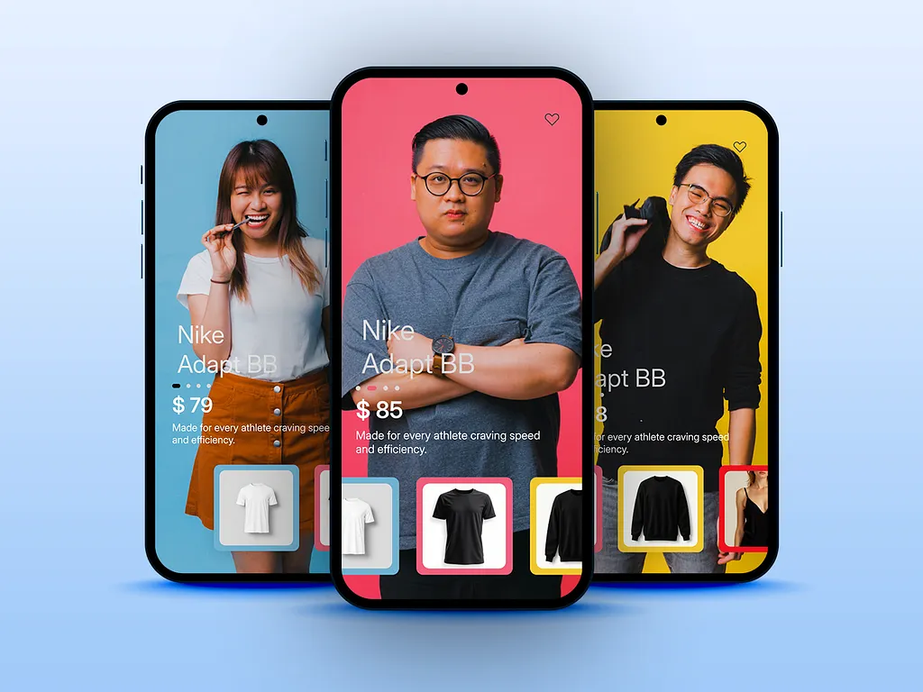
Typography and color choices are functional, not merely decorative. They determine how quickly visitors can process information and how confidently they act, contributing to overall ecommerce UX best practices.
Typography That Reduces Cognitive Load
High-converting WooCommerce stores in 2026 use fewer typefaces, stronger hierarchy, and larger text:
- Maximum two typefaces – one for headings, one for body. More creates visual noise.
- Body text at 16–18px minimum – smaller text causes eye strain on mobile and creates accessibility barriers.
- Clear hierarchy – H1 for product names, H2 for section headings, H3 for supporting details. Hierarchy guides the eye through the conversion path.
- 1.5–1.7× line height for body text reduces reading friction significantly.
Color That Guides Action
Every element on a page competes for attention. Color hierarchy determines what wins.
The Add to Cart button should be the most visually dominant element on any product page. This means a clear contrast with everything around it. A muted, ghost-style Add to Cart button is a conversion liability. Accent colors should be used sparingly and consistently – if your brand uses a specific color for actions, it should appear only on CTAs, badges, and links, not scattered decoratively.
White space is a conversion tool, not wasted space. Clean, airy layouts reduce cognitive load and allow product imagery to command attention. In 2026, the dominant ecommerce aesthetic leans heavily toward generous spacing and soft, neutral backgrounds – reflecting a broader shift toward clarity and calm that directly correlates with purchase confidence.
Green communicates confirmation and trust. Using it for “In Stock” badges, checkmarks, and successful validation messages leverages deeply ingrained visual associations to reduce friction at key decision points.
6. Social Proof Design – Making Reviews Do Real Work
Most WooCommerce stores display reviews as an afterthought: a plain-text tab buried below the fold. High-converting stores treat social proof as a first-class design element.
- Review summaries near the top. Star rating and total review count displayed directly beneath the product title – before the visitor reads anything else.
- Pull quote callouts. The most compelling one- or two-sentence review excerpts are displayed as styled blocks adjacent to the product description or near the Add to Cart button.
- UGC galleries. Customer photos and videos of the product in use serve dual purposes: visual social proof and filling the gap that professional photography leaves – “What does this actually look like in real life?”
- Owner responses displayed. Showing that the store responds to reviews – especially critical ones – signals active customer care and builds trust with prospective buyers, evaluating how problems get handled.
7. Accessibility as a Conversion Multiplier
Accessibility is often framed as a legal obligation. That framing undersells the commercial case: accessible design converts better for everyone.
Consider what accessibility improvements actually involve:
- High color contrast – also makes text readable in bright sunlight and on aging screens
- Large, clearly labeled buttons – also reduces tap errors on mobile for every user
- Descriptive alt text – also feeds image search and improves SEO
- Clear error messaging – also benefits every user who makes a form mistake
In 2026, accessibility standards are incorporated into ecommerce expectations, with regulatory pressure strengthening across the EU, UK, and US. A WooCommerce store built with accessibility is reaching a broader audience on a foundation that serves all users better. The business case is direct: inclusive design means more conversions from a wider range of visitors.
Putting It All Together
These trends are not independent. A fast site with a poor checkout still loses customers. A beautiful product page with no social proof creates doubt at the final moment. Conversion design is a system – each element supports the others.
The stores outperforming their competitors in 2026 are not those that redesigned once and moved on. They are the ones treating design as a continuous optimization discipline – testing hypotheses, reading data, and removing obstacles between motivated visitors and completed purchases, one decision at a time.
Every pixel, every millisecond of load time, and every trust signal either moves that goal forward or works against it. Design accordingly.
Frequently Asked Questions (FAQs)
1. How do I measure if design changes actually improve conversions?
Track your baseline conversion rate for 2+ weeks before making changes. Then implement one change at a time and measure the results over the same period. Use Google Analytics 4 to segment by device, and tools like Hotjar to see where users drop off. A 5-15% uplift is typical for individual improvements.
2. Designer vs. WooCommerce theme – which should I choose?
Conversion-focused themes cost $100-500 and work well for stores under $50k/month. Hire a custom designer ($3k-15k+) if you want differentiation and higher revenue potential. For mid-market stores, use a good theme as the foundation and customize from there.
3. Which payment methods should I prioritize?
Priority order: (1) Apple Pay + Google Pay, (2) Credit/debit card, (3) PayPal, (4) Buy Now, Pay Later (Klarna, Afterpay). Don’t add more than 4-5 options—too many create decision paralysis. Remove options used less than 2-3% of the time.
4. How long until I see conversion improvements?
Quick wins (speed, sticky buttons, fewer checkout fields) show results in 1-2 weeks. Full redesigns take 4-8 weeks. Mobile changes typically show faster results since mobile drives 60-75% of traffic. Track at least 100 transactions per change before deciding on success.
5. Should I redesign everything at once or make small changes?
Make small, gradual changes. Big redesigns create too many variables – you won’t know what worked. Prioritize: checkout first (70% impact), then product pages, then homepage. Test each change for 2-4 weeks before moving on.
Subscribe to Our Newsletter
Get the latest WordPress tutorials, trends, and resources right in your inbox. No Spamming, Unsubscribe Anytime.

Thank you for subscribing to our newsletter!

Table of Content
- Why "Good Design" Is No Longer Enough
- 7 WooCommerce Design Trends Dominating 2026
- 1. Mobile-First Design - Done Properly This Time
- 2. Speed Is a Design Decision - Core Web Vitals 3.0
- 3. Product Page Design - The Make-or-Break Moment
- 4. Checkout Design - Where 70% of Revenue Is Being Lost
- 5. Typography and Color - The Invisible Conversion Lever
- 6. Social Proof Design - Making Reviews Do Real Work
- 7. Accessibility as a Conversion Multiplier
- Putting It All Together
- Frequently Asked Questions (FAQs)
- 1. How do I measure if design changes actually improve conversions?
- 2. Designer vs. WooCommerce theme - which should I choose?
- 3. Which payment methods should I prioritize?
- 4. How long until I see conversion improvements?
- 5. Should I redesign everything at once or make small changes?