How to Make Your WooCommerce Store Stand Out in 2026


If you’ve browsed WooCommerce stores recently, you’ve probably noticed something strange.
They all kind of look the same.
Same theme. Same product page layout. Same boring shop grid. Same checkout flow.
Most WooCommerce store owners don’t realize how generic their store looks until they line it up next to five competitors. By then, shoppers have already bounced.
Standing out isn’t about chasing fancy design trends. It’s about making your store feel deliberate, fast, and simple to navigate. That’s what this guide will show you how to do.
Why Most WooCommerce Stores Look the Same
Walk through 20 WooCommerce stores, and you’ll see the same patterns over and over.
Most store owners pick a popular theme like Storefront, Astra, or OceanWP. They install the demo. They swap in their logo. They upload products. Done.
The problem? Thousands of other stores did the same thing.
Here’s a quick test. Open a brand like Bombas or Allbirds in one tab. Now open a typical default Storefront demo in another. The difference isn’t the budget. Its intent. Bombas and Allbirds designed every section to communicate something specific about who they are. The default demo just fills space with placeholder content.
What makes most WooCommerce stores look identical:
- Same default themes and demo layouts
- Same generic product page structure
- Stock photos that scream “I bought this online.”
- Buy buttons that blend into the background
- Sliders, sliders, and more sliders on the homepage
- No real brand voice in the copy
Looking unique is not about a flashy homepage. It’s about every page feeling like your store, not someone else’s template.
What Standing Out Actually Looks Like
Let’s clear up a myth. Standing out doesn’t mean wild colors, weird fonts, or experimental layouts.
It means looking and feeling deliberate.
A WooCommerce store that stands out usually has these traits:
- A clear brand personality you can spot in seconds
- A faster, smoother shopping flow than competitors
- Product pages that answer real buyer questions before they’re asked
- A mobile experience built for thumbs, not only for desktops
- Trust signals are visible without scrolling
Get these right, and you’re already ahead of 80% of WooCommerce sites out there.
Build a Brand That Shoppers Remember
Most stores fail at branding before they even launch. Fix this part first.
Pick a color system, not just a color
Don’t just choose one color. Choose a system.
Use 1 primary color for your brand, 2 secondary colors for accents, and 1 high-contrast color for buttons. The button color should never blend into the page.
A common mistake: using a soft pastel for the “Add to Cart” button. Pretty, but invisible. That button needs to demand attention.
I once audited a small skincare store whose conversion rate had stalled at 0.8%. The owner couldn’t figure out why. We pulled up her product page, and the buy button was a soft taupe, almost the same shade as the background. We changed it to a bold coral. Two weeks later, conversion was up 2%. Same product. Same traffic. Just one button.
That’s the kind of detail most owners miss.
Use typography as a personality tool
Pick two fonts max. One for headings. One for body text.
Your heading font sets the tone. A bold sans-serif feels modern and direct. A serif feels editorial and premium. A handwritten font feels casual and small-batch.
Match the font to your brand, not to what’s trending on Pinterest.
Replace stock photos with real ones
Stock photos kill trust faster than almost anything else.
Even basic phone shots of your real products beat polished stock images. Show the product in real environments. Show it being used. Show the packaging being opened.
Real photos signal a real business. Stock photos signal “I’m not sure about this either.”
Redesign the Pages That Actually Convert
Some pages matter more than others. Spend your design time where it actually moves the needle.
The product page
This is the most important page on your store. It’s where buying decisions happen.
A high-converting WooCommerce product page needs:
- A gallery with zoom, multiple angles, and at least one lifestyle shot
- A sticky add-to-cart button on mobile
- Price is placed close to the CTA
- A scannable description with short paragraphs and bullet points
- Reviews visible above the fold or in a clear tab
- Clear shipping and return info
- Variation swatches (color, size) instead of plain dropdowns
If your product page does only one of these well, fix the others before touching anything else on your site.
The shop and category pages
The shop page is where browsing turns into buying. Most look like a wall of identical tiles with no personality.
Quick wins:
- Use visual category cards with real images, not text-only links
- Add filters that actually help (price, color, size, availability)
- Add a quick view option so shoppers can preview without clicking through
- Show stock and rating right on each tile
The checkout page
A messy checkout is the fastest way to lose a sale. According to Baymard Institute research, the average ecommerce cart abandonment rate sits at around 70%.
Cut friction here:
- Use a one-page checkout when possible
- Remove fields you don’t actually need
- Show trust badges and payment icons near the pay button
- Offer guest checkout
- Make the pay button impossible to miss
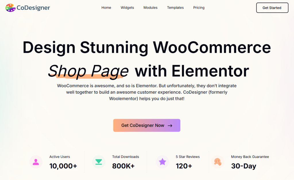
Practical takeaway: CoDesigner (WooCommerce Elementor Builder) lets you redesign all these pages using drag-and-drop widgets made for WooCommerce stores. You can build custom product pages, add quick view options, a wishlist, advanced filters, and checkout layouts from a single plugin.
Add the Features Shoppers Already Expect
Modern shoppers have been trained by big brands like Amazon and well-designed Shopify stores. They expect the optional features.
If your WooCommerce store is missing these, it feels dated:
- Wishlist
- Quick view from the shop page
- Product comparison
- Product Image Slider
- Variation swatches with color and image previews
- Sticky add-to-cart on mobile
- A cart drawer that slides in instead of a full cart page reload
- Advanced filters with multiple options
Stacking five separate plugins to add all this is a bad idea. It slows your site down and creates compatibility headaches. A single design plugin with these features built in is much cleaner.
Make Your Mobile Experience the Priority
Mobile commerce is projected to account for over 60% of ecommerce sales in 2026, according to Statista. If your store looks great on desktop but breaks on mobile, you’re losing the majority of your buyers.
Check these on your phone right now:
- Are tap targets at least 44 pixels?
- Is there any horizontal scrolling?
- Is the add-to-cart button sticky on the product page?
- Do filters open as a slide-up drawer or are they crammed in a sidebar?
- Are images lazy-loaded so the page doesn’t drag?
- Is the menu thumb-friendly?
Test on a real phone, not just the browser preview. They behave differently. Better yet, hand your phone to a friend and watch them try to buy something. You’ll spot five problems in 60 seconds.
Speed Up the Store (Design Means Nothing If It Loads Slow)
A beautiful store that takes 6 seconds to load is a failed store. Google research found that bounce probability jumps 32% when page load time goes from 1 to 3 seconds, and 90% when it goes from 1 to 5.
Speed fixes that actually move the needle:
- Convert images to WebP (smaller files, same visual quality)
- Compress images automatically on upload
- Regenerate thumbnails after a theme change or size update
- Remove plugins you’re not actively using
- Pick a lightweight theme over a feature-bloated one
- Use a caching plugin
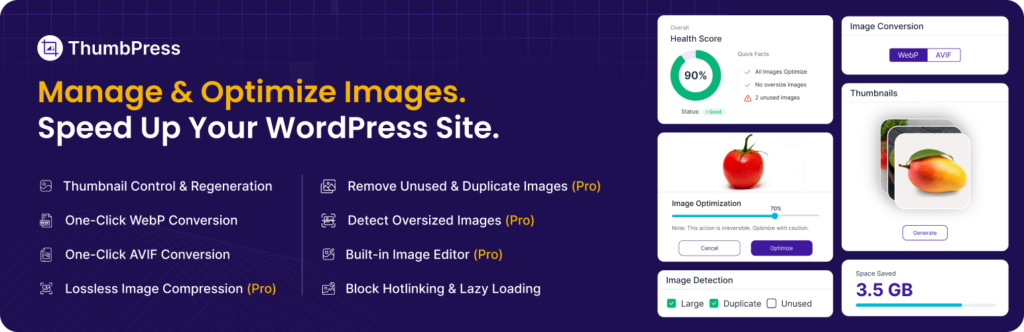
Practical takeaway: ThumbPress is built for image optimization on WordPress and WooCommerce sites. It auto-converts uploads to WebP, compresses images before they hit your media library, and regenerates thumbnails when you switch themes or change image sizes. It also detects duplicate images, which keeps your media library clean.
Faster pages mean better rankings, lower bounce, and more sales. Speed is a design feature, not a technical detail.
Use Design to Build Trust
People don’t buy from stores they don’t trust. And trust is mostly built through small design choices that most owners overlook.
Here’s why each trust signal actually works:
- Reviews matter more than you think. Shoppers trust other shoppers. Even three or four honest ones near the product title can make a real difference.
- Get customers to add photos too. Nothing sells like seeing a real person actually using the thing. It’s as close to a friend’s recommendation as you can get.
- Return and shipping policy near the buy button, not buried in the footer. If you have a good return policy, don’t hide it. That’s the stuff that tips people over the edge.
- Don’t forget to show payment icons where required. Shoppers recognize Visa, PayPal, Apple Pay, etc. logos instantly, and it quietly tells them you’re legit.
- Show your face on your About page. A real photo and a short story about why you started goes a long way. People buy from people, not logos.
- Make it easy to reach you. A visible email or live chat tells shoppers someone’s actually home, and stores that hide their contact info make people nervous.
If a shopper has to dig for any of this, they leave.
Common Mistakes That Make Stores Look Generic
These are the patterns that show up again and again on WooCommerce stores that fail to stand out:
- Sticking with the default theme demo
- Using only stock photos
- Hiding reviews at the bottom of the page
- Cluttered homepage with 5+ sliders or banners
- Ignoring mobile design completely
- Slow page speed from unoptimized images
- Buy buttons that blend into the page
- Generic product descriptions copied from the manufacturer
- No filters or weak filters on the shop page
- Long, multi-step checkout
Fix even half of these, and your store will feel sharper than most of your competitors.
A quick reality check: design alone won’t save a bad product or the wrong price point. But for stores with decent products and the wrong design, fixing this often unlocks 20–30% more conversions in a short window. The investment is small. The upside is real.
A Simple Action Plan to Stand Out (Step-by-Step)
You don’t need to redesign everything in one weekend. Use this order to make progress without burning out:
1. Audit your current store on a real phone. Note every spot where it feels slow, clunky, or generic.
2. Pick a brand color system. One primary, two secondary, one high-contrast for buttons.
3. Replace generic photos. Real product shots beat stock images every time.
4. Redesign the product page first. This is where buying happens.
5. Add quick view, wishlist, and better filters. Use one plugin, not five.
6. Optimize images and overall speed. WebP, compression, thumbnail regeneration.
7. Watch a real customer use your store. Hand your phone to a friend or family member who has never seen the site. Watch silently. Their hesitations will tell you more than any analytics dashboard.
Each step takes a few hours, not weeks. Stack them up and your store starts looking nothing like the rest.
Final Thoughts
Standing out as a WooCommerce store isn’t about chasing trends or piling on features. It’s about making the store feel like a real brand built by a real person, not a clone of someone else’s template.
Your brand should be obvious. Your product pages should answer questions before shoppers ask them. Your mobile experience should feel as smooth as flipping through a magazine. Your store should load in under 3 seconds.
A design plugin like CoDesigner handles most of the page-level work. An image plugin like ThumbPress handles the speed side. Together, they cover the two biggest things shoppers notice: how the store looks, and how fast it feels.
The stores that win in 2026 won’t be the ones with the most features. They’ll be the ones that feel like they were built by someone who actually cared. Design like that owner. Then ship it.
FAQs
Do I need to know how to code to make my WooCommerce store look unique?
No. Drag-and-drop tools like CoDesigner let you build custom product pages, shop pages, and checkout designs without touching code.
Will customizing my WooCommerce store slow it down?
Only if you stack too many plugins. A single design plugin with built-in features is faster than five separate plugins doing similar jobs.
How long does a WooCommerce store redesign take?
A focused redesign of the homepage, product page, and checkout usually takes 1 to 2 weeks for one person working part-time. With a designer or developer, it can be done in a few days.
Should I switch themes to stand out?
Not always. A flexible page builder layered on a lightweight theme often works better than hunting for the perfect theme. Switching themes also means rebuilding parts of your site every time, which adds risk.
Which WooCommerce page should I redesign first?
The product page. It’s where buying decisions happen and it has the biggest impact on conversion. Fix this page and the rest of the site benefits too.
How do I speed up my WooCommerce store?
Start with images. They’re usually the heaviest part of any ecommerce page. Convert them to WebP, compress on upload, and regenerate thumbnails after theme changes. Tools like ThumbPress automate all of this.
What’s the simplest way to add wishlist and quick view to WooCommerce?
Use a design plugin that includes both features, instead of installing a separate plugin for each. Fewer plugins means a faster site and fewer compatibility issues.
Subscribe to Our Newsletter
Get the latest WordPress tutorials, trends, and resources right in your inbox. No Spamming, Unsubscribe Anytime.

Thank you for subscribing to our newsletter!

Table of Content
- Why Most WooCommerce Stores Look the Same
- What Standing Out Actually Looks Like
- Build a Brand That Shoppers Remember
- Pick a color system, not just a color
- Use typography as a personality tool
- Replace stock photos with real ones
- Redesign the Pages That Actually Convert
- The product page
- The shop and category pages
- The checkout page
- Add the Features Shoppers Already Expect
- Make Your Mobile Experience the Priority
- Speed Up the Store (Design Means Nothing If It Loads Slow)
- Use Design to Build Trust
- Common Mistakes That Make Stores Look Generic
- A Simple Action Plan to Stand Out (Step-by-Step)
- Final Thoughts
- FAQs
- Do I need to know how to code to make my WooCommerce store look unique?
- Will customizing my WooCommerce store slow it down?
- How long does a WooCommerce store redesign take?
- Should I switch themes to stand out?
- Which WooCommerce page should I redesign first?
- How do I speed up my WooCommerce store?
- What's the simplest way to add wishlist and quick view to WooCommerce?